my studio was given a site right in the heart of downtown copenhagen.

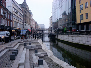
the red circle top right is the site. it's on a small street off of 2 big streets. down left from there is the church of our lady (the national cathedral of denmark; bombed by the british in 1807; the site of the royal weddings; the meeting place for our bus trips). it's also right by DIS (my school), which is to the left of the square with the fountain on the bottom of the picture.

the orange building on the left (currently the "surf bar") is what we had to work with. we could either tear it down or build new, sticking to a maximum of 4.5m x 9m x 2 storeys. i tore it down.
we were given 4 works of art, and were to design a gallery to house them. here they are:
THE GOLDEN HORNS

"Amongst the most famous finds from Danish prehistory are the Golden Horns. These are not only unique; their story has also been a very dramatic one. The Golden Horns were made around the year 400 AD and were decorated with both Nordic and Roman motifs. The combined weight of the horns was nearly 7 kg. The long horn was found in 1639 at Gallehus, near Møgeltønder, in Southern Jutland. A few metres away the short horn was found in 1734. This bore the runic inscription ekhlewagastiR : holtijaR : horna : tawido, in English “I Lægæst, son of Holt (or “from Holt”) made the horn”. Both horns were stolen and melted down in 1802. The appearance of the horns is known solely from drawings dating to the 17th and 18th centuries. Therefore many details are uncertain. The copies made in 1859-60 are too large, but presumably show the proper shape, while the twisted set from the 1970s have the right size."
THE JUKE BOX
nothing too special here (regardless, sorry for the missing photo). the juke box holds a huge variety of songs, and it set up to play for free. it's currently on display in the lobby of a church, tucked away in the corner. there are plans for it to be udpated and digitized.
THE PH GLASS PIANO

this piano was designed by the famous danish designer poul henningsen. both his nickname (PH) and lamps (the artichoke) are very well known. the "glass" sections of the piano are actually plastic. still, that doesn't take much away from its beauty.
PER NORGARD SOUND PIECE
this clearly isn't the sound piece, but in instead norgard himself. he's arguably the most important danish composer of the 20th century. norgard's pieces (like the one i was given) are based on the infinity series for serializing melody, harmony, and rhythm. this produces music which is unusually hectic, yet beautiful still.
*that was more or less it in terms of requirements. we were then set free to be creative.
this sequence of model photos shows the all-important PROCESS. in order words, this was my progress from day 1 to day 46 in model-form. i prefer to work with models, and not drawings like most people.

my first model, done in 1:50 scale like the rest. it's simply a box, to help me figure out what i had to work with.

i got more complex here, and had some fun [wasting time] putting in windows. this model actually pulls apart, similarly but less complex than the following.

definately got carried away here. at this phase we were still developing "concept" models. however, i was getting unessecarily detailed. at least it was fun to build.

i felt as though i was keeping to conventional, and wanted to be more abstact. i have no idea what i was thinking, but this is what i came up with.
this was the turning point in the project. i was frustrated with my design(s) and torn about where to go from there. then i came up with this next idea, and have been happy ever since :)

i started playing with voids in the mass, working from inside out instead of outside in.

the concept here is horizontal slabs of the same material.

the final design really took form with this model. i used cardboard because it was free, and also to show that horizontal layering. the brass supports in the back were for modeling purposes (but turned out to look sharp enough to stay).

this photo shows the yin and yang (balance) of the building. the solid spaces create the dark access, as they are closed rooms designed to be dark based on their contents. the voids are the light access, with the juke box on the right and piano top left. the middle area (where the stairs would be) is the transitional/overlapping area.
from here i did a lot of thinking... and a bunch of searching for materials. i finally decided on sandwiching concrete and glass

MY FINAL MODEL!!!

and my heap of models...

street view from the left (refer back to the photo of site)

the front facade

view from the right
the side elevation
lit up 1

the first room. the golden horns would be on display in the 2 display cases in the middle.

this old woman is siting on the bench, watching who is presumably here husband jam out on the juke box.

the view up the stairs. check out the light in the front room penetrating through the wall.

i'm proud of these stairs.


the PH glass piano from the top stairs.

the top floor/room. this guy would be enjoying a wild composition and an LED light-show on the floor.

here's me at my final crit/presentation (photo courtesy of long-time friend matt libby). there's my model in my hand, and my board behind me. my adrenaline was so high that the whole thing was a blur. it was great though.
assignment 2 in all was the most amazing academic experience of my life. it was strange at first having zero experience in architecture. other kids at least had 1 or 2 studios under there belts. this provided a challange, but also enabled me to start fresh (untainted as my professor refers to it).
the combination of the following is what has made whole experience so special:
1) the studio atmosphere: working closely with other passionate students makes for a great working environment. people are constantly asking or giving advice. if 2 minds are better than 1.
2) my studio teacher courtney was an incredible inspiration. she's simply a bredth of knowledge, and just listening to her talk makes my mind start racing. it's great, but i have to take a break from her some times.
3) unleashing my bottled-up interest for architecture. i used to always say i wan't to be an architect, but never pursued it. in the past year or so i started to question it, but then stopped myself and decided i wouldn't make any decisions until after my semester abroad. it's getting close to the end, and i'm positive it's what i want to do for the rest of my life.
4) going in to the last week of the project, i had a feeling what crunchtime would be like. that's one of the things that had caused me to hesitate about architecture: the stressful deadlines. i hate stressing, but found that it wasn't stressful at all, because i loved doing the work. once i realized that, the rest was gravy.
5) still, i worked my ass off in prepartation for the arrival of my best friend, ben. i wanted to forget about my project for a while, and focus on a much-needed reunion. so while everyone else was working through the weekend, i planned on having as much fun as possible.
the magnitude of what came next i can't explain in words. i was woken up saturday morning with my oldest friend (since i moved to maine in 1st grade) matt libby on top of me in my bed. ben had told me he had a surprise, but i had no idea what it was. let me tell you, it was the best surprise ever. i was in copenhagen with ben and matt, in addition to my buddy billy who we all grew up with and it currently abroad with me. it was the most epic of reunions! and in the midst of what i considered to be the most important academic project of my life. that thought would have prompted some serious anxiety in the past. everything came together.
that week was the best of my life.


